
Plotting Visualizations In Python

I am a Technical Writer and an Open Source Fanatic.
Producing visualizations in data science is an important skill one must master over time. For me it took ages to really understand and actually produce quality graphs, so today we going to look at how we can produce simple graphs and also take a look at some mainly used libraries.
Matplotlib and Seaborn
Matplolib is a python library used for plotting graphs and works well with Pandas and Numpy. It is a powerful tool for visualising data, creating statistical interferences and plotting 2D graphical arrays. Seaborn is also used for plotting graphs with the help of Matplotlib,Pandas and Numpy. It is useful for producing beautiful and decorative themes for Matplotlib graphics.
I'll be using data imported from freeCodeCamp pageviews.
Let's get started !
Firstly we going to import the necessary libraries :
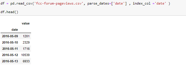
Next we going to import the data , parse and set the index column to date :
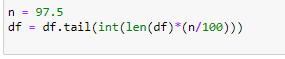
We'll filter out days where the pageviews where in the top 2.5% and below 2.5% of the dataset :
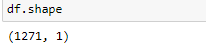
After filtering we can quickly check the shape of our dataset :
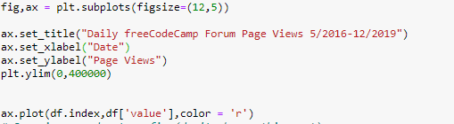
Now that we have prepared the data, we going to create our first graph which is going to be a line plot :
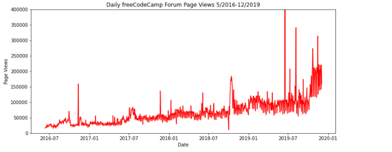
We have added the title, x-axes and y-axes to our plot, we also added the 'plt.ylim' function in order to set the y-axes limit. Here is our output :
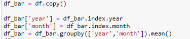
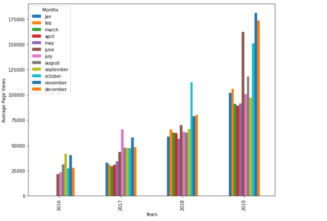
For the next plot we going to copy the same data from the line graph and modify to a monthly stacked bar plot :
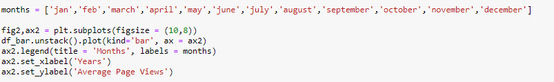
 Below we going to prepare our bar plot and make sure the legend shows the month label :
 Output :
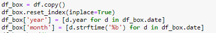
After creating the stacked bar plot, we going to copy the data and modify for our next graph :
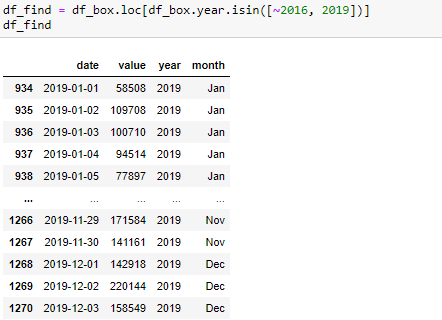
 We going to filter and sort the data from the year's 2016 - 2019 :
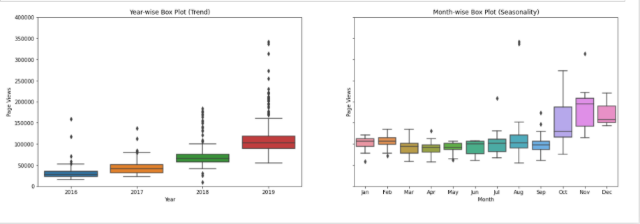
 Below we going to prepare the Box plot graph :
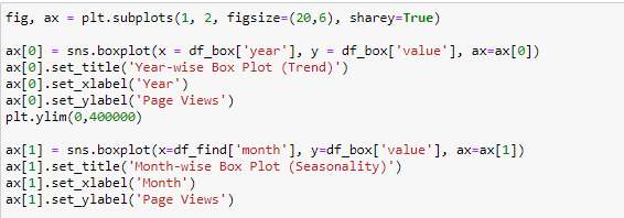
Output :
Lastly we going to create a Heat map using another dataset for Github
We'll read the dataset as a text file and convert it to csv :

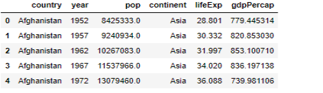
After converting the data we'll load the first 5 rows using the df.head() function :
 Output:
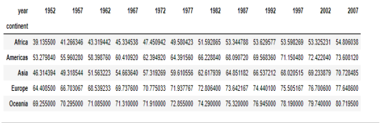
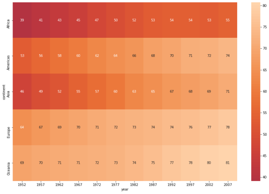
We going to create a pivot table using the Dataframe (df), with the x-axes as Year, y-axes as Continent and lifeExp filled within the cells:
 Output :
After creating the pivot table, we'll use the data to plot a Heatmap :
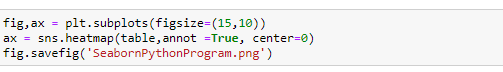 The ‘annot =True‘ attribute will add text to each cell of our heatmap, the ‘center =0’ attribute places the values into the center of the colormap when plotting and ‘fig.savefig’ saves our heatmap as a .png file.
Output :
Voila !
Additional resources
We have created some basic visualizations, below are additional resources for further reading/reference :
Let me know your thoughts, suggestions and comments. Also please like, share and follow me as this also motivates me to write more. Keep smiling 😊😊


